Making Sense of Data with Google
 Last week I completed Making Sense of Data a free online class offered by Google.
I was excited to learn from the experts in Google and challenge myself. I had a few aha! moments.
Best part of this course was clear direction and validation all along the way.
Last week I completed Making Sense of Data a free online class offered by Google.
I was excited to learn from the experts in Google and challenge myself. I had a few aha! moments.
Best part of this course was clear direction and validation all along the way.
This course emphasises Prepare , Analyse & Apply model by identifying secondary questions that are specific and measurable to answer the primary question. There were a few thousand attendees from all over the world registered for this course.
For my final project I analyzed the pre-course and mid-course questionnaire to find out how successful this course was. Below are my observations (not validated by Google)
-
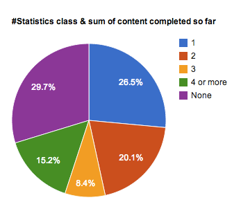
Attendees with no statistics class completed more content (unit 1, 2 & 3 combined) than other attendees with statistics class. Pie Chart above explains this observation.
-
Attendees working with data daily had the highest engagement (added up support and communication related questions)
-
Attendees with 5+ years experience working with data had the highest average overall enjoyment
This course is still going to be available online. I highly encourge this course for anyone interested in analytics. Below is more information on getting started!
Tags
- analytics
- data
- training
 Harish Chakravarthy is an intrapreneur leveraging technology to make a positive difference.
Interests include API integration, user experience, data visualization and analytics.
Harish Chakravarthy is an intrapreneur leveraging technology to make a positive difference.
Interests include API integration, user experience, data visualization and analytics.